
Designing an onboard web app that works!
On.board is a SaaS web app designed to be a market solution that improves the onboard process within companies.
Role
Lead and solo designer—
discovery, user research,
prototype, and testing
Team
Individual Project
Duration
4 months
Tool
Adobe XD
Cross road
On.board’s mission is to build a ecosystem for the new hire, so at the beginning of the project I had to decide which way I was going, if I was going to try to create something for a specific company and within a specific scenario - then I would do the onboard based on the problems of that company, or if I was going to a market solution with a more comprehensive footprint.
Because of the necessity of access to companies, I ended up going for a market solution. So the design of the web app is an opportunity to create a onboard experience that is easy to understand, intuitive, with simple and clean communication.

Competitor analysis
I conducted a benchmark and gathered the main pain points in each direct competitor.
There’re more than 100 HR and employee management apps for onboarding listed as direct competitors.
I selected three main competitors, they’re: Bamboo HR, Talmundo and CakeHR.
By going through the user reviews and utilizing the apps, I came to the conclusion the following are some of the pain points I can tackle in order to elevate the end-to-end user experience:
01. The site architecture have to be simpler (users complained that they felt like they were in a maze sometimes).
02. Communication fails with the work team within the platform.
03. The app does not offer full autonomy to the user.
04. As easy as the platform is, the interface is confusing.

Online surveys and
user research
In aim to validate and further understand problem areas and opportunities, I conducted a online survey and 5 deep interviews considering four user types: Employee, Human Resources (HR) and Manager.
The survey aims to carry out quantitative and qualitative questionnaires, with a focus on gain a greater understanding of the past experiences of these professionals (HR) with the integration of new employees, in addition to trying to understand their opinions about this process and ways of applying it.
This were some of the questions and answers:
Reflect on the companies where you have worked, tell us about your integration process within the company.
Most of the responses had a very close relationship with the duration of onboarding and the way the company carried out this process, one person replied:
" I've had good and bad experiences of onboarding. The last one, I didn't have any onboarding. I didn't know how things worked, who the people were, who I should go to if something happened, without a formal presentation to the team, Nothing. In others I have already received that old welcome kit, with pen, office supplies, etc. Informing how things were, the sectors, I asked to see a PPT presentation. There was even a process called "welcome kit" which was a small test where the new employee answered "
Another point to be highlighted was a response that reported the difference of onboarding in companies with different scales. The interviewee said:
" I have had experiences with both large companies and family micro-enterprises. What I identify as very distinct characteristics between these two companies was that in the larger one, the integrations were much more distant, totally within the professional etiquette that the company preached. In the other company where we were only 5 employees, the atmosphere was more relaxed and in a way more "friendly" "
User research
After the the survey, it was time to talk face to face with my public. For the interviews i wanted to take a deep dive into the experiences of my interviewies. I wanted to know how to onboarding process was done in their companies; which points that the onboarding was failing when being executed and last, but not least, how much money was being put to make a great onboarding process.
The interviews were excellent and i gathered great insights that guided me throughout the whole project. Here's a few insights from the interviews:
01. There is no effective method to improve communication between the new employee and other sectors of the company
02. Companies do not synthesize their content, causing information overload on new employees
03. The HR sector is so busy with its tasks that new employees end up feeling lost during the initial periods
and end up distancing themselves from other employees
As time per interview was 45 min average, feedback collected was valuable but coming from three different perspectives, affinity mapping was crucial to frame ideas together that could be in the MVP starting point.

Employees have high expectations
New employees have high expectations when they arrive at new companies. They expect communication response time to be short and HR teams to be knowledgeable and careful. These new employees want the integration process to be done efficiently.
Employees want to feel welcomed
Employees want to feel safe and welcomed in the hands of the company. It is vital that employees feel convinced that they have made the right choice when joining the team. The more important the involvement of all sectors is, the more confidence will have throughout their life within the company.
Less company and more human
I could see that many onboarding processes are done with a focus on the company. Its history, objectives and etc. What these companies fail to understand is that onboarding is applied to improve the experience of a new employee. To think that they've chosen to work on account of these achievements is naive. There are other factors that weigh in the final decision.
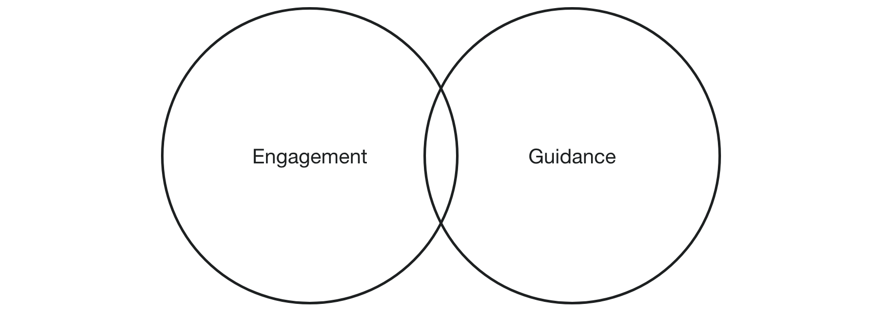
On.board principles
Onboarding is the time for managers to develop relationships that are grounded in understanding. It’s the time to get curious and learn about their new team member, both personally and professionally. What are your new team members top strengths? What are they doing when they’re at their best?
In order to create new communication lines evolving the existing process, some features were key to be considered for an initial Minimum Viable Product (MVP) following 2 principles:
Prioritization
With these two principles in mind and after analyzing the insights from the user interviews and survey, I considered the time frame available for the project and used the MosCoW method to prioritize the features for the MVP.
Must (MVP): Meet your team and all the employees; Send a message; Inbox; Individual
mentoring and schedule mentoring; Training;
Should (3 months goal): Integration with google agenda; Assign a mentor; Inside
community;Login and register
Could (6 months goal): Collaborative projects; Google Drive share integration;
Relocation.
Won’t: Newsletter; Live lessons; Add people.

According to the book Algorithms to live by, when faced with unknown situation, people have the tendency to use explore/exploit tradeoff. To explore is to try out new things to gather knowledge. To exploit is to use that information to perform tasks efficiently.
So, from the insights of the research report with users, I started to explore the possible solutions to the problems found from the interviews using job stories and exploit these explorations using wireflows to understand how I could create the information architecture.
To explore
In order to make the onboard for the new hires delightful and easy, I used a method called job stories. The main objective is to create possible scenarios that the user will face (using the insights of the interview as base) to predict and reduce the number of errors and facilitate user learning. This way we can focus only on the core user flow.
There’s one example of a few job stories scenarios:
01. Familiarity with staff
JS: When I’m in the onboard process and need to get to know other members of the company, I want to do it in a simple way, so I get to know everyone quickly.
Feature: Create a section containing all employees
To exploit
From the job stories, wireflows were created to illustrate the user flow. The flow was first thought of in a mobile environment, and then it was adapted to the desktop.

Information Architecture
The next step of my process was to develop the navigation system. In order to accommodate both beginner and expert users, I wanted to leverage an architecture where there is a single point of start and single prominent ability to take action in each stage of the journey.

Development Phase
Once I organized all my insights from the exploration phase, I began to design the web app. To start this process I began sketching in order to identify how the above IA would look like in terms of screens and various other states based on the wireflows. This allowed me to quickly explore several concepts for the web app layout.

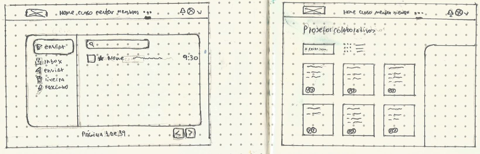


Wireframe
Based on the feedback and personal insights I learned from the sketching phase, I began to design my first wireframes using Adobe XD. I made sure to prioritize the features that would best address the needs of the users throughout the website.


Validation
Once I completed my wireframes, I created a prototype of my website to begin usability testing. This would allow me to evaluate how users would engage with the proposed web app solution and validate whether it was addressing the user needs. It was important to test with mid-fidelity, greyscale wireframes to gather honest, critical feedback from potential customers and to solidify the functionality of the website before addressing the
visual design.
I conducted a usability test with 4 participants and asked them to complete three different scenarios to put themselves into the shoes of my user personas.
These three scenarios included:
01. Imagine that you are a newly hired company. The HR sector sent in your email access to the internal onboarding platform. Upon entering the platform you would like to get acquainted with the people who already work for the company, but mainly, take questions with an available mentor.
02. Imagine that you have been using the platform for a while and would like to make an appointment with the mentor of your choice. Select a mentor and schedule a mentoring.
03. You are actively using the platform during your initial period at the company where you work and you have very little time to complete the first part of your training. Take the final questionnaire to complete step 1 of your preparation.
1. Fluid navegation
2. Members page were too crowded
3. The majority of the participants didn’t liked the training section
4. Participants found hard to spot the mentoring feature
5. Participants though that the menu had too much options
Clean, simple and functional
01. Dashboard
I kept the dashboard clean and simple to avoid overwhelming users on first page they see
and to allow users to easily locate themselves and go to other screens I included a global navigation bar on the top. The dashboard have four main sections (overview, progress, messages and schedule mentoring) that serve as guide to show the new hire the most important information right of the bat.

02. Training
One the most important thing to have on a onboarding is training. This is the feature that the new hire is going to use to learn about the company, his role and what is expected from him or her.

So I had to make this feature a straight forward one. I had to make easy enough for any employee to use. And to make the information stick, I incorporated the spaced repetition theory. This way the new hires will be prepared for all the task the the company send to them.

03. Members
One of the problems that the participants of the interviews said they had throughout their lives, was that they felt lost when they started working on a new company because they didn’t knew anyone inside. So creating a screen that can connect the new hire to other employees, mentors, his team and the directors was vital.

In this screen the new hire can check who's on his team and also can see all the employees registered in the company, all of that with a single click.

Beside been able to check who’s in your team, the new hire can access the profile on every single person on the company to see more detail about them.

04. Messages
This feature was though to facilitate the communication between the new hires, mentors and the head of each sector in the company. The new employee can also send messages to other people to learn about they activities before they met in person. This way the new collaborator will be more prepared and learn how each team work internally.


05. Mentoring
Following the guidance principle that were applied to this project, the mentoring feature is one of the most essencial to help new hires in the initial period of training. In the web app the new employee can schedule a meeting right in the dashboard.

The new hire can start a mentoring call in the message screen as well.

The new hire can start a mentoring call in the message screen as well.

The next steps
This case study represents the start of a bigger design process for the development of this onboard web app. The next steps I would like to take for this project would be to continue to conduct usability testing and further iterate on my designs. Given more time, I’d like to explore more ways to implement the features listed in the moscow method.I had a blast working on this project for Awari. I am certain that I have just touched the surface of the entire delivery ecosystem and need a lot more contextual and user analysis to identify new challenges and needs.
