
Boosting your daily productivity with taskie.
Taskie is a daily task management app that seeks to help users have a better organization and be more productive.
Role
Lead and solo designer—
discovery, user research,
prototype, and testing
Team
Individual Project
Duration
6 months
Tool
Adobe XD

Introduction
In the last decade, the smartphone has contributed a substantial amount to the technology industries, increasing profits and enriching companies in several areas, from communication to entertainment.
But In the past two years, prominent figures in the industry have begun to voice their concerns. These concerns include how smartphones monopolize attention and consume users time much more than they would like.
The National Centre for Biotechnology Information claimed that the average human attention span has dropped from 12 seconds in 2000 to 8 seconds in 2013.
In a world where almost any piece of information we might ever like to access is at our fingertips. Daily news comes in handy seven-second-infographics, and friends are never more than an instant message away. We have an important question to ask ourselves: is information technology eroding our minds?
Was with this problem that i though about a solution. I adopted a value-sensitive Design approach, focused on going beyond just problems, tasks and activities, exploring values that stakeholders try to express in their lives. This approach resulted in Taskie.
It all started with trying to understand more in depth the productivity and multitasking subject, I began this research with the assumption that the targeted user base will be a wide range of people including teenagers, college students, and working professionals. After developing the interview questions and overall research plan, I sought out people to interview, while pinpointing the main points that i was going to base my interview questionnaire, they're:
- How the users organize themselves in a daily basis.
- What are the productivity problems that you face and what do you do to overcome them.
- And, obtain insights on how the smartphone usage affects them.
Interview Summary
After interviewing 6 people, the surveys and interviews revealed a few core user needs in goal setting and task management. Overall, people reported the desire for a product that would not only help them stay organized and keep track of goals and tasks, but to be able to clearly see how tasks are related to goals, the progress they are making towards accomplishing the goals as well.
This were some of the questions and asnswers of the interview:
Tell me the negative impacts that the use of the cell phone brings in your day-to-day?
" Most of the times I take out my cell phone to perform this task, I get distracted and look for another task that was not even my initial goal. This results in almost 2 hours with the cell phone in hand. "
Can you describe the process of doing something you want during the day?
" I get the demand. I write down what I need to do and then separate goals into lists. When the process is digital, I separate the segments by color. "
What is your opinion about the culture of intensive cell phone use?
" It is an aspect of technological advancement. We know the negative impact it has on interpersonal relationships. However, just as the industry, regardless of the segment, does not carry out its processes without computers and / or the advances in robotics, we, from contact with the internet through the smartphone, immerse ourselves. "
The surveys helped me gain a broader insight as to what issues my users was having. The research findings support my conclusion that the industry create products to make us addcted using them. If products were designed for healthy use, consumers would still buy and use smartphones since its value has been proven as being an essential tool.
These are the takeaways from the tests:
High usage of the phone
Smartphones interfere heavily in their daily productivity.
High percentage of procrastination
Often times the users catch themselves using the phone when they don't need and end up "losing" a few hours of their day.
The is no incentive to habit change
They know that the overuse of smartphone can bring some big problems, yet they don't take any action to change this habit.
Benchmarking
In order to get a stronger grasp on the apparent issues, I analyzed competitors who have attempted to design for a similar research problem.
There’s a bunch of to-do apps, so I selected the ones that are most prominent in the industry and that have features that i wanted to understand more, they’re: Forest, Any.do and Habitica.
During benchmarking I could see that the main apps that seek to improve user productivity use two main devices, they are: the use of the pomodoro technique and the implementation of gamification elements.


Synthesis
Based on my market research and the interviews, my primary key user personas emerged — the spontaneous, entrepreneurial Millennial who sets goals and tasks as needed, they are young people in the age group of
20–24. These people are considered as primary because they are the ones who is exposed to the technology and have hands-on knowledge about new apps and gadgets.
The personaa helped to highlight some core user priorities: people want a tool that helps them save time, that syncs across devices, that connects tasks to bigger-picture goals, and that helps them stay organized and feel in control of what they need to accomplish.
I summarized the finding in a persona and later expanded with a empathy map:

By grouping the data collected from the survey and competitive analysis, the insights start to become more visible: motivation, pain, goals, frustrations, etc.

I also found out that the users think that creating lists for their daily tasks is a monotonous processes and they often don't have planning time, motivation or energy to do so. The users said that create habits becomes a boring and tiring process.
Customer journey map
I had to understand what my user is currently doing in order to address this problem. What are they doing on a day to day basis to be able to work on those hobbies? based on what i gathered with the interviews, I developed an journey map that allowed me to see, step by step, what my user does when they want to find a productivity app. With this map i can understand possible user problems and identify their behavior when using the app.

What came to light was that my user wasn’t actually doing much about it and their hobbies were being neglected due to focusing on work and deadlines that took higher priority. Productivity slumped when it actually came to completing the tasks resulting in being distracted, taking more frequent breaks and no staying focused on that task at hand.
Prioritizing features
With the research I had collected and synthesized, I came up with three key unique features that are not currently found together in one app:
1. Reward system in the app
This system aims to bring a gamification element to the app. The user will gain medals as they finishes the tasks, and can use this medals to unlock features within the app.This way the user can unlock all the app's features without paying for it, or the user can unlock only the featuers that he desires.
2. Pomodoro method feature
Allow users to select a specific task and apply a time to complete. This will be the time slots that the app will not place any tasks in.
3. A Google agenda integration
This system will allow the user to keep track of important tasks without switching between to third party apps.

Information architecture
After deciding which features to prioritize, I created an IA to have a more stable structure for the next phases.

Ideation & paper prototype
The sketches was the first step to help me get an idea of what the app would look like visually.
I made low-fidelity prototypes based on the IA that I made. Starting with prototyping on paper helped me organize the elements within the interface while I focused on functionality, rather than how the final product would look.
Furthermore, the simplicity of the prototype allows me to test ideas quickly.


With the sketches at hand, i conducted an early stage usability testing with paper prototyping with 4 participants to test the fluidity of the app, know if task creation is a simple and objective, and to identify whether the icons are consistent with their tasks

Most screens were understood by the users and they're able to follow the flow of screens correctly. This is my takeaways:
Positive:
- Easy navigation
- Layout clean and easy to understand
- The user liked the objectivity of the task
creation process
Negative:
- The user did not notice the create task button on the home
- Little spacing between options
Wireframe
With the feedbacks on my paper prototype i iterate more on Adobe XD to create a refined version of the app to be used later on a more elaborate usability test.


Validation
Once I completed my wireframes, I created a prototype of my app to begin usability testing. This would allow me to evaluate how users would engage with the proposed app solution and validate whether it was addressing the user needs. The test with paper prototype was crucial to make the mid-fi, greyscale wireframes. They are perfect to gather a honest, critical feedback from the participants and to solidify the functionality of the app before addressing the visual design.
The usability test was conducted with 4 participants.
These the results from the tests:
Pain points
- The user found the onboardings boring, but necessary
- There was a delay in finding the main buttons
- There was a lack of better direction regarding the choice of colors for clickable buttons
What went right
- Clean and objective interface
- User liked the task creation flow
- The organization of the agenda
- Users liked the challenges tab
- Ease of learning and memorizing actions in the app
What went wrong
- Task creation is not satisfactory
- The content of the onboardings was not clear enough for users
Final Design
For the final design i took the results of the test and did more iteration to get to a place that would improve the usability and some of the visual design for the users. I did the following to better the user experience:
01. Improved the use of colors within categories
02. Refined the hierarchy of text within the task creation screen
03. Better the descriptive text within each screen
04. Changed some icons for better communication
05. Enhanced the color of buttons to make them stand out
01. Onboarding
The main value of the onboarding process needs to serve, is to set initial expectations from the app, and to get the minimum information we need from the user in order to get started. I did this by showing a simple walkthrough and used illustrations to ease the information assimilate

02. Home
During the competitor analysis i realized that various task management app, tend to contain many elements on the screen. I seeked to reduce complexity by making a clean and objective layout.

03. Project groups
On this page the user can select previously created tasks and group them into projects, which may contain: members, description and categories.

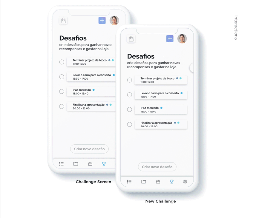
04. Reward system
One of the biggest challenges when the app is out, is to make the user comeback to use. So I thought of a challenge-based reward system, where the user chooses the difficulty he wants and if he accomplish the challenge, he receive a reward that can be used inside the store to unlock other features within the app.
05. Focus mode
In addition to having a challenge-based reward system, Taskie also have a "Focus mode".This mode uses the pomodoro technique to help the users focus on the tasks that they want to perform. And like the challenges, when completing a session, the user receive a reward that can be spent inside the store within the app.

Conclusion
The whole process of studying the user's needs and how they react to certain solutions, taught me to listen and understand with an open mind. I learned to be patient and willing to immerse myself deeply within the problem in question and within the world of users, to really understand the challenge, ask lots of questions and listen openly to the answers.
I believe this concept is a good place to start. It implements good UX practices as a solution to a common problem, using the technology we have today, and it can dramatically improve the user retention for this kind of apps. What I love about designing such products is that by increasing user retention, i’m actually helping people live healthier lives, which is, IMO, a big deal.
